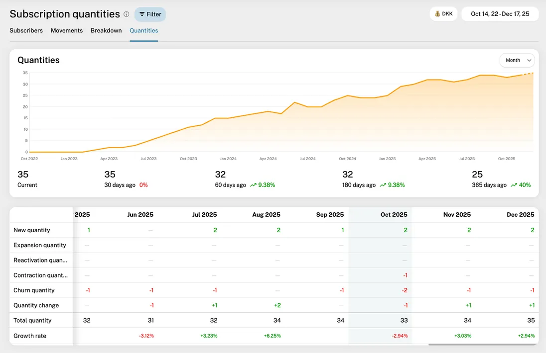
Subscription Quantities
The Subscription Quantities report provides a detailed view of the total number of units, seats, or licenses active across your subscription base. While the Subscribers report tracks unique customers, this report focuses on the total volume of billable units, making it essential for seat-based or volume-based pricing models.
Overview

The Subscription Quantities report includes a chart, a breakdown table, and optionally a detail table. Each is described here:
Timeline chart
The timeline chart shows your total active quantity (e.g., total seats) over the selected period. If you hover the chart, you'll see a tooltip with the quantity movements broken down by type (explained under the Breakdown table). The currently ongoing period is marked with a dashed line. You can adjust the chart data using the date picker, interval selector, and various filters.
Note that the numbers for a given period show how the total quantity looked at the end of the period.
Breakdown table
The table underneath the chart shows the quantity movements, broken down into types: New, Expansion, Reactivation, Contraction, and Churn. Each type is explained here:
New: The quantity (seats/units) added by brand-new customers who started a paid subscription.
Expansion: Quantity growth from existing customers, such as an account adding more seats or upgrading to a plan with a higher unit count - or adding an add-on subscription
Reactivation: Quantity recovered from returning customers who previously churned.
Contraction: Quantity lost from existing customers who reduced their seat count, downgraded to a plan with fewer units, or removed an add-on subscription.
Churn: Quantity lost from customers who cancelled their subscriptions entirely.
Net Change
The net change in total quantity during the period (New + Expansion + Reactivation - Contraction - Churn).
Total Quantity
The total number of active units/seats at the end of the period.
Each cell of the table shows a number representing the sum of units for that movement type. Red numbers indicate negative movement (Contraction, Churn), and green numbers indicate positive movement (New, Expansion, Reactivation).
If you click a cell, a detail table under the breakdown table is revealed, showing the individual customer movements that contributed to that specific quantity change.
Detail table

This table is revealed when you click a cell in the breakdown table. It lists every individual quantity change in the selected period. You see the date, customer name/email, the description of the event, the movement type, and the specific quantity change (e.g., +5 or -2).
Clicking a customer entry will take you to that customer's detail page.
Filters
The report supports a wide range of filters to help you analyze specific segments of your seat-based growth:
Date range
Select a custom range or preset periods (last 30 days, last quarter, etc.).
Interval
Choose how quantity changes are aggregated: daily, weekly, monthly, quarterly, or yearly.
Additional filters – plan, region/country, billing frequency, and customer age. (see all filters)
Exporting the data
You can export the table as a CSV file for offline analysis or reporting by clicking the "Export" icon next to the date picker.
Practical tips
- Expansion vs. New: Compare "New" quantity with "Expansion" quantity. If Expansion is higher, your existing customers are your primary growth engine (common in "Land and Expand" strategies).
- Seat Churn vs. Customer Churn: Use this report alongside the Subscribers report. If your "Total Subscribers" is flat but "Total Quantity" is dropping, your customers are staying but downsizing their usage (Contraction).
- Average Account Size: Use the "Total Quantity" and divide by "Total Subscribers" to calculate your average seats per customer, which is a key indicator of moving upmarket.