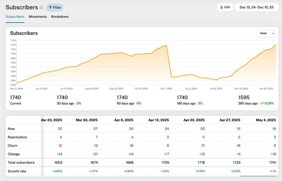
Subscribers
The Subscribers report provides a detailed view of your active customer count over time. It is a fundamental tool in GrowPanel for tracking customer acquisition, retention, and the overall health of your user base.
Overview

The Subscribers report includes a chart, a breakdown table, and optionally a detail table. Each is described here:
Timeline chart
The timeline chart shows your active subscriber count over the selected period. If you hover the chart, you'll see a tooltip with the subscriber movements broken down in types (explained under the Breakdown table), and you'll see the corresponding period marked in the table underneath. The currently ongoing period is marked as a dashed line. You can adjust the chart data using the date picker, interval selector and a wealth of filters, explained in the Filters section underneath.
Note that the numbers for a given period shows how those numbers looked at the end of the period.
Breakdown table
The table underneath the chart shows the subscriber count, broken down into movement types: New, Reactivation, Churn, and the resulting net change. Each type is explained here:
New
The number of newly acquired customers who started a paid subscription.
Reactivation
The number of returning customers who previously churned but started a new paid subscription.
Churn
The number of customers who cancelled all active paid subscriptions and became inactive.
Change
The net change in the number of subscribers during the period (New + Reactivation - Churn).
Total subscribers
The total number of active, paying customers at the end of the period.
Growth rate
The percentage change in Total Subscribers compared to the previous period (Change / Subscribers at start of period $\times$ 100).
Each cell of the table shows a single number, representing the count of unique customers that contributed to that movement type or total. Red numbers typically indicate negative movement (Churn), and green numbers indicate positive movement (New, Reactivation).
If you click a cell, a detail table under the breakdown table is revealed, showing the individual customers or churn events in the selected period and type.
Detail table

This table is shown when you click a cell in the breakdown table. The table shows each subscriber movement in the selected period and type. You see the date, customer name/email, the description of the movement, and the type (New/Reactivation/Churn).
Clicking the customer sends you to that customer's detail page.
Filters
The report supports a wide range of filters to help you focus on specific segments of your customer base. These include:
Date range
Select a custom range or preset periods (last 30 days, last quarter, etc.)
Interval
Choose how subscriber counts are aggregated: daily, weekly, monthly, quarterly, or yearly
Additional filters – plan, region/country, billing frequency, payment method, customer age, etc. (see all filters)
Filters are applied to both the chart and the table simultaneously.
Exporting the data
You can export the table as a CSV file for offline analysis or reporting by clicking the "Export" icon next to the date picker.
Practical tips
- Use the interval selector to understand the velocity of your customer base changes. Daily or weekly intervals are great for monitoring recent signups and churn spikes.
- The Growth rate provides an easy way to understand if your customer base is accelerating or slowing down.
- Use "All time" in the date picker to see the full historical growth of your subscriber base.
- Combine multiple filters to isolate specific customer segments or product lines, enabling precise retention and acquisition insights.